
What is a “Cause and Effect Diagram”?
A cause-effect diagram is a visual tool used to logically organize possible causes for a specific problem or effect by graphically displaying them in increasing detail, suggesting causal relationships among theories. A popular type is also referred to as a fishbone or Ishikawa diagram. Cause-Effect can also be diagrammed using a tree diagram.
When diagnosing the cause of a problem, a cause-effect diagram helps to organize various theories about root causes and presents them graphically.
The C-E Diagram is a fundamental tool utilized in the early stages of an improvement team. The ideas generated during a brainstorming or affinity process are used to populate the diagram. Since the list of issues on a C-E may be very large, the team should use a prioritization or multi-vote technique to narrow the list of potential cause that they desire to investigate farther.
At the head of the diagram is the “Effect” that the team is investigating. The team brainstormed potential causes for this effect. The skeleton becomes the various potential causes and the headers are the column heads from the affinity diagram.
Cause and Effect Diagram Examples
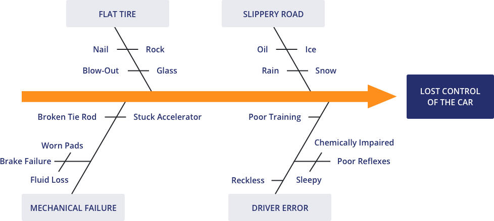
A simple cause-effect diagram is shown in Figure 29. The phenomenon to be explained is “Lost control of car.” Some of the possible major factors contributing to that lost control are a flat tire, a slippery road, mechanical failures, and driver error. Each of these major categories of causes may, in turn, have multiple causes. A flat tire may come from a nail, a rock, glass, or a blow-out from material failure. The causal relationship can be traced back still more steps in the causal chain if necessary or appropriate. Lost control may arise from a mechanical failure; that failure may be a brake failure, which, in turn, may come either from fluid loss or from worn pads. You can probably think of other factors to add to this diagram.
Cause and Effect Diagram Example: Lost Control of Car
As we can see from Figure 29, this tool has three prominent basic features:
- It is a visual representation of the factors that might contribute to an observed effect or phenomenon that is being examined.
- The interrelationships among the possible causal factors are clearly shown. One causal factor may appear in several places in the diagram. For example, if temperature affects both moisture content and physical dimensions, then temperature would appear in both places.
- The interrelationships are generally qualitative and hypothetical.
A cause-effect diagram is usually prepared as a prelude to developing the data needed to establish causation empirically.
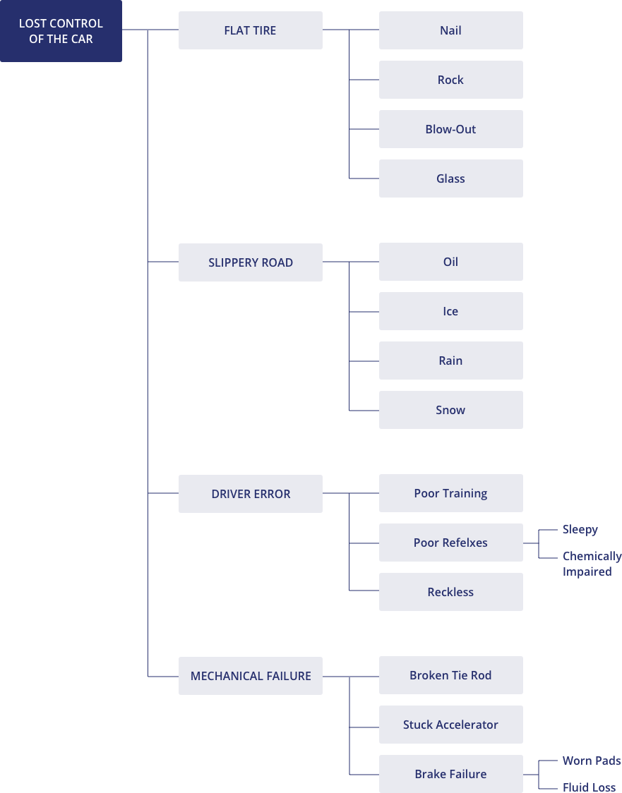
Cause and Effect Tree Diagram Example: Lost Control of Car
The cause-effect tree is conceptually similar to the cause-effect diagram. It is sometimes easier to construct, and some computer software packages have adopted this form. Figure 30 reproduces the contents of Figure 29 in a tree form.
Cause and Effect Diagram Key Concepts
- A cause-effect diagram cannot identify a root cause; it presents graphically the many causes that might contribute to the observed effect.
- It is a visual representation of the factors that might contribute to an observed effect that is being examined.
- The interrelationships among the possible causal factors are clearly shown. One causal factor may appear in several places in the diagram.
- The interrelationships are generally qualitative and hypothetical.
- It focuses the attention of all team members on the specific problem at hand in a structured, systematic way.
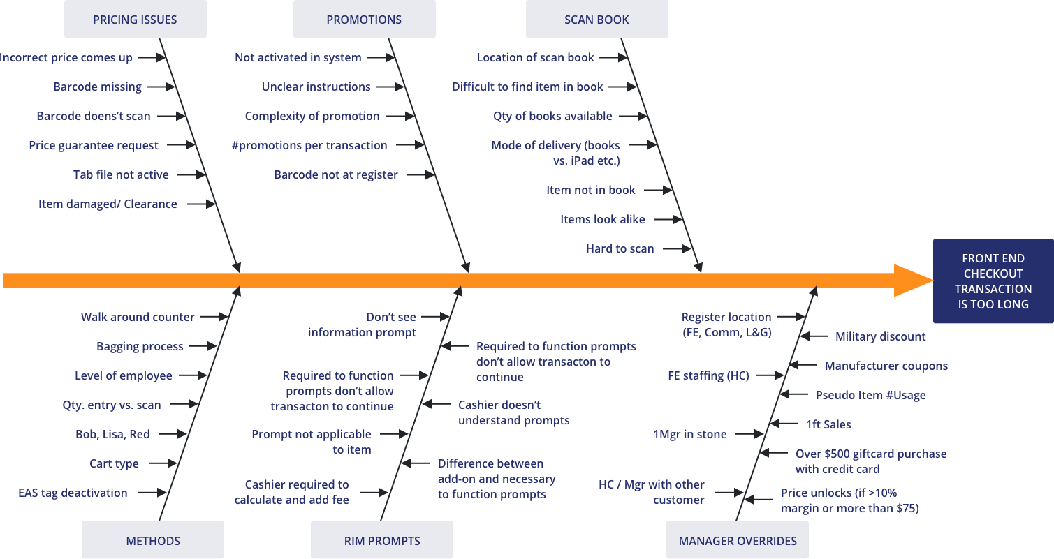
The following image is an example of a Cause and Effect Diagram.
Cause and Effect Diagram Components
Cause and Effect Sequence Relationship
The most important consideration in the construction of a cause-effect diagram is a clear understanding of the cause-effect relationship.
When one has completed the diagram, one should be able to start at any endpoint and read the diagram as follows (using Figure 29 as an example): “Snow causes the road to be slippery. The slippery road causes loss of control of the car.” Alternatively, one can start with the phenomenon being explained and read it backward like this: “Control of the car was lost because the road was slippery. The road was slippery because it had snow.” In a properly constructed diagram, reading any of the branches in this way should make good sense. We may not have evidence on which cause was actually the culprit, but the statement should make good logical sense.
All possible sources of causation need to be considered. There are at least four classes of causes that may apply to any problem:
- Objects such as machines and material
- Conditions such as motivations, temperature, or level of demand
- Timed sequence in the process such as time of day or sequence in production
- The effects associated with place such as a particular production line, the loading dock, the distributor, or a particular branch office.
These are the what, why, when, and where of cause and effect and should always be asked. In addition to the 4 W’s (what, why, when, and where), teams that use cause-effect diagrams have developed two other lists that help them remember to consider these several classes of possible causes for a problem. These lists are characterized as the 5 M’s in manufacturing and the 5 P’s in services, as follows:
- Manpower: People (employees)
- Materials: Provisions (supplies)
- Methods: Procedures
- Machines: Place (environment)
- Measurements: Patrons (customers)
People have found the W’s, M’s, and P’s helpful aids in remembering to consider a full range of possible causes. There is, however, no particular magic in the specific words, and they do not all apply in all cases. You may find one of these lists helpful or develop your own. The important point is to consider all possible sources of causation by posing a number of questions such as, “What procedures do we have that might cause this problem?”
Key Strengths of the Cause and Effect Diagram Tool
The major advantage of this tool lies in the fact that it focuses the attention of all the people involved with on the specific problem at hand in a structured, systematic way. It encourages innovative thinking and still keeps the team on track in an orderly way. The 5 Whys can be applied to the brainstormed theories to get to suspected root causes.
The second key strength of this tool is that its graphic representation allows very complex situations to be presented, showing clear relationships between elements. When a problem is potentially affected by complex interactions among many causes, the cause-effect diagram provides the means of documenting and organizing them all.
For the same reason, the C-E diagram has a tremendous capability of communicating to others.
How to Construct a Cause and Effect Diagram
Getting Ready
Construct a cause-effect diagram when you have reached the point of developing theories to guide the characterize step. The knowledge to be used to construct the cause-effect diagram comes from the people familiar with the problem and from data that has been gathered up to that point.
Some of the power in a cause-effect diagram is in its visual impact. Observing a few simple rules below will enhance that impact.
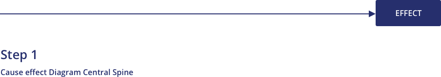
Step 1: Define the Effect
Define clearly the effect or symptom for which the causes must be identified. The “effect” must be defined in writing. For additional clarity, it may be advisable to spell out what is included and what is excluded.
If the effect is too general a statement, it will be interpreted quite differently by the various people involved. The contributions will then tend to be diffuse rather than focused. They may bring in considerations that are irrelevant to the problem at hand. For example, “Too many customer complaints are being received by the Customer Service Department” is probably too vague. Spend more time on the analysis of the symptoms so that the specific problem for investigation can be stated more like, “The number of customer complaints about overbooking of flights has doubled in the last year.”
Of course, the effect should also be directly related to the goal statement.
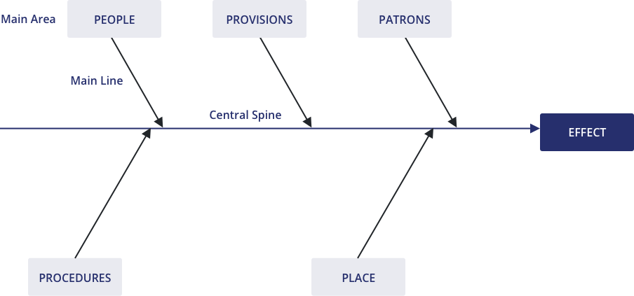
Step 2: Place the Effect
Place the effect or symptom at the right, enclosed in a box. Draw the central spine as a thicker line pointing to it, as in Figure 35.
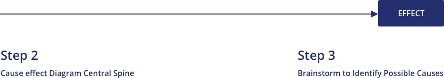
Step 3: Identify Possible Causes
Use brainstorming or a rational step-by-step approach to identify the possible causes. There are two possible approaches to obtaining contributions for the causes to be placed on the diagram: brainstorming and a rational step-by-step approach. You, the team or its leadership will need to make a choice based on an assessment of readiness.
Brainstorming would normally be indicated for a team with a few individuals who are likely to dominate the conversation in a destructive manner or for a team with a few individuals who are likely to be excessively reserved and not make contributions. Also, brainstorming may be best in dealing with highly unusual problems where there will be a premium on creativity.
If one uses brainstorming to identify possible causes, then once the brainstorming is completed, process the ideas generated into the structured order of a cause-effect diagram. This processing will take place in much the same way as described below for the step-by-step procedure, except that the primary source of ideas for inserting in the diagram will come from the list already generated in brainstorming rather than directly from the team members.
If the team members are prepared to work in that environment, a step-by-step approach will usually produce a final product in less time, and the quality of the proposed causal relationships will normally be better.
In the step-by-step procedure, begin by identifying the major causes or classes of causes that will be placed in the boxes at the ends of the main spines coming off the central spine of the diagram.
It may helpful to start with some simple mnemonic lists of possible major areas as a reminder of the many possible sources of causative factors. These lists are characterized as the 5 M’s in manufacturing and the 5 P’s in services, and are as follows:
- Manpower: People (employees)
- Materials: Provisions (supplies)
- Methods: Procedures
- Machines: Place (environment)
- Measurements: Patrons (customers)
The 4 W’s can also be used as important guides to a full exploration of the possibilities:
- What
- Why
- When
- Where
These are just helpful places to start. Start with one of these sets of categories and, after a while, rearrange the results into another set of major areas that fit its particular problem more appropriately.
After identifying the major causes, select one of them and work on it systematically, identifying as many causes of the major cause as possible. Take each of these “secondary” causes and ask whether there are any relevant causes for each of them.
Continue to move systematically down the causal chain within each major or secondary cause until that one is exhausted before moving on to the next one. Ideas may surface that should apply to an area already completed. Be sure to backtrack and add the new idea.
Step 4: Place the Major Causes
Each of the major causes (not less than two and normally not more than six) should be worded in a box and connected with the central spine by a line at an angle of about 70 degrees. Here, as well as in subsequent steps, it has proved useful to use adhesive notes to post the individual main and subsidiary causes about the main spine. Since these notes can be easily attached and moved, it will make the process more flexible and the result easier for the participants to visualize. Figure 36 generalizes the diagram to this point.
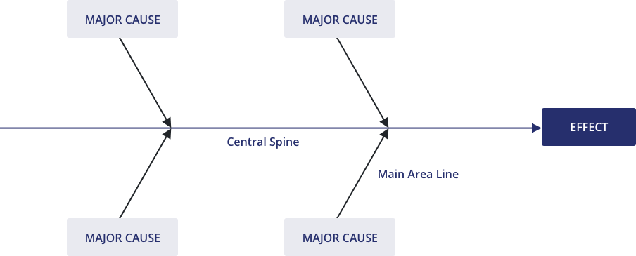
Step 5 (Part A): Add Causes to Main Area
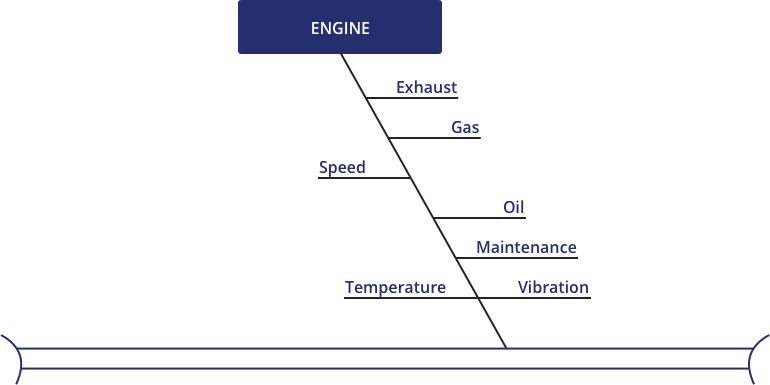
Add causes for each main area. Each factor that is a cause of a main area is placed at the end of a line that is drawn so that it connects with the appropriate main area line and is parallel with the central spine. Figure 37 shows how to display a number of possible causes of problems arising from an engine, which is a main area for some larger symptom that is being explained.
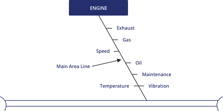
C-E diagrams are generally easier to read and appear more visually pleasing if the text is placed at the end of the line as in Figure 37. Other users have placed the text on the line like Figure 38. Text on the line tends to be harder to use and read, especially as more levels of subsidiary causes are added.
Step 5 (Part B): Less Desirable Placement
Step 6 (Part A): Add Subsidiary Causes for Each Cause
Add subsidiary causes for each cause already entered. Each of these causes is placed at the end of a line which is drawn (1) to connect with the line associated with the factor that it causes and (2) parallel with either the main area line or the central spine. Figure 39 is an amplification of the portion of a C-E diagram introduced in Step 5. Note how the governor and throttle have been added as possible causes of the wrong speed of the engine. Throttle malfunction may result from either of two causes: Faulty calibration or defective linkage.
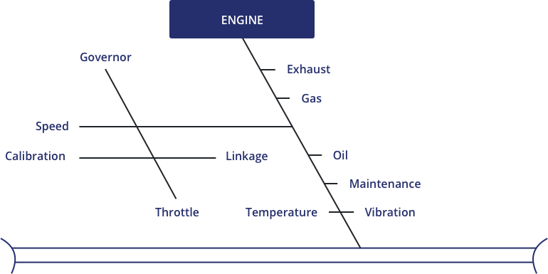
Keeping the lines parallel makes reading easier and the visual effect more pleasing. Clearly, when one is actually working on a C-E diagram in a team meeting, one cannot always keep the lines neat and tidy. In the final documentation, however, it is found that using parallel lines makes for a more satisfactory diagram. A diagram composed of lines with random orientation like the following example is harder to read and looks less professional.
Step 6 (Part B): Less Desirable Placement

Step 7: Continue Adding Possible Causes
Continue adding possible causes to the diagram until each branch reaches a root cause. As the C-E diagram is constructed, team members tend to move back along a chain of events that is sometimes called the causal chain. Teams move from the ultimate effect they are trying to explain, to major areas of causation, to causes within each of those areas, to subsidiary causes of each of those, and so forth. When do they stop? Teams should stop only when the last cause out at the end of each causal chain is a potential root cause.

A root cause has three characteristics that will help explain when to stop. First, it causes the event the team had sought after—either directly or through a sequence of intermediate causes and effects. Second, it is directly controllable. That is, in principle, team members could intervene to change that cause. In the engine example, we have been using in this section, speed cannot be controlled directly. Control of speed is dependent on proper functioning of the throttle and governor, but proper control with the throttle is dependent on correct calibration and proper functioning of the linkage. The calibration and the linkage can be controlled. They are root causes.
Third, and finally, as the result of the other two characteristics, if the theory embodied in a particular entry on the diagram is proved to be true, then the elimination of that potential root cause will result in the elimination or reduction of the problem effect that we were trying to explain.
Step 8: Check Logical Validity of Each Causal Chain
Check the logical validity of each causal chain. Once the entire C-E diagram is complete, it is wise to start with each potential root cause and “read” the diagram forward to the effect being explained. Be sure that each causal chain makes logical and operational sense. Consider the following example, which is a portion of a C-E diagram seeking to explain errors in an order-entry process. One main area of errors concerns errors in the part numbers. Sales representatives look up the part in a catalog and enter the part number on an order form. The information from the form is then keyed into a database.
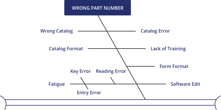
Start with the proposed root cause “keying error.” Then read it as follows: “Keying errors cause fatigue which causes the wrong part numbers…” Once we try to read the diagram, the problem becomes clear. Keying errors do not cause fatigue; fatigue causes keying errors, and the diagram should be reorganized as follows.
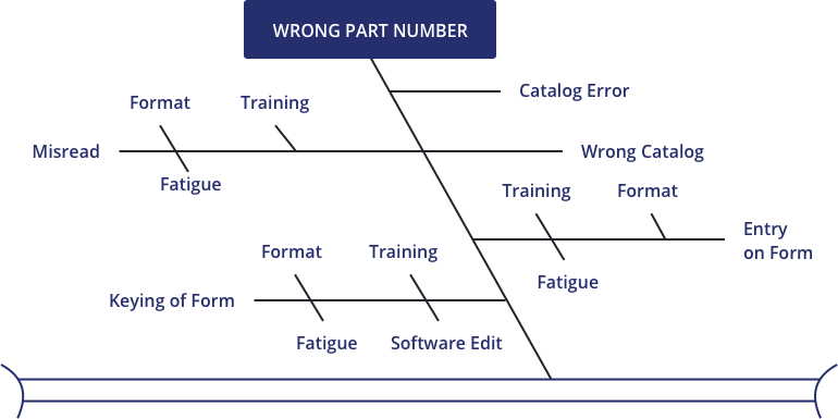
This redrawn diagram places fatigue, format, and training as root causes of three different intermediate causes of the wrong part numbers —misreading the catalog, entering the data on the form improperly, and keying the data improperly. Because these now trace out logical causal chains, it is easier to devise effective ways of testing the theories. For example, form formats which cause problems in keying may differ from those which create problems in the original pencil entry.
The general “lack of training” cause on the original diagram is normally a good danger sign that the causal chain needs to be checked. Lack of training in reading the catalog will create reading errors, but if the errors come at the keying stage, no amount of training on use of the catalog will do any good. Whenever one sees “lack of training” (or lack of anything else for that matter) on a C-E diagram, one should ask two questions. First, exactly which skill is training lacking in? And second, how does that lack cause the factor being explained at the moment? As we saw in our example here, answers to those questions may help identify missing intermediate causal factor and causal relationships that are stated backward.
Step 9: Check for Completeness
As discussed more fully in the interpretation section, check for the following:
- Main branches with fewer than three causes
- Main branches with substantially fewer causes than most others
- Main branches that go into less detail, with fewer levels of subsidiary causes than do the others
- Main branches that have substantially more causes than most of the others
The existence of one of these conditions does not automatically mean a defect in the diagram; it merely suggests that further investigation is warranted. At this point, it is also good to double check that the 4 W’s, 5 M’s, and/or 5 P’s are considered as appropriate.
When to Use Cause and Effect Diagrams
Formulating Theories
The chief application of the cause-effect diagram is for the orderly arrangement of theories about the causes of the observed quality problem that the team is assigned to resolve. Once the theories are well understood and ordered, then the team will use its best collective judgment to identify those theories which should be tested. The final objective of the characterize step is the identification of the primary root cause or causes of the team’s problem.
There are also other opportunities for organizing theories. The team may want to know why some part of the process works better than other parts. For example:
- Why does automobile A obtain ten percent better mileage per gallon than all other similar vehicles tested?
- Why is the productivity of assembly line B always higher than the productivity of the other lines?
Designing for Culture
During the Improve step, the cause-effect diagram may also be useful for the team in considering the cultural impact of its proposed remedy. A cause-effect diagram can sometimes be helpful in thinking systematically about the resistance that the proposed solution is likely to meet. If the phenomenon to be explained is resistance to the proposed remedy, then the team can construct a cause-effect diagram to help identify the most important resistances it will need to address.
How to Interpret Cause and Effect Diagrams
The Result
The cause-effect diagram does not provide an answer to a question, as some other tools do. Its main value is to serve as a vehicle for producing, in a very focused manner, a list of all known or suspected causes which potentially contribute to the observed effect. At the time of generating the cause-effect diagram, it is not usually known whether these causes are responsible for the effect or not.
A well-prepared cause-effect diagram is a superb vehicle for helping to reach a common understanding of a complex problem, with all its elements and relationships clearly visible at whatever level of detail is required. The output of the diagram can be leveraged by prioritizing potential causes or theories for further investigation.
The Difference between Theory and Fact
We have noted that cause-effect diagrams present and organize theories. Only when theories are tested with data can we prove causes of observed phenomena. The cause-effect diagram helps organize the search for the causes, but it does not identify the causes. Other tools, such as Pareto analysis, scatter diagrams, and histograms, will be used to analyze data to establish the causality empirically.
Checking for Completeness
As a cause-effect diagram is constructed, it should be reviewed for completeness. There can be no exact rules for this review, but some guidelines are helpful. Some of these are discussed in more detail in the construction section.)
Be certain that you have at least asked how each of the 4 W’s and each of the 5 M’s or 5 P’s might apply to the effect.
Generally, each main branch of the diagram will have at least three or four additional branches. If one does not, further consideration of that branch may be advisable to verify that it has been understood fully.
If some main branches have substantially fewer causes attached to them, or if the causes on them do not go back as many steps in the causal chain, you may not have as full an understanding of that element of the process as you do of the others. It may be appropriate to seek theories from additional persons familiar with that element of the process.
If some branches appear overloaded with causes compared to the others, consider whether they might be most appropriately divided into two or more main branches.
Verify that the cause at the end of each causal chain is potentially a root cause. Such a potential root cause will normally satisfy three conditions. (1) You can trace a logical causal relationship from that cause, through all its intermediate causes, to the final effect being explained. (2) That cause is, in principle, directly controllable. (3) Therefore, if shown to be true, that cause could be eliminated, and the effect would disappear or be reduced.
Potential Pitfalls and Problems in Interpretation
The most serious possible misinterpretation of a cause-effect diagram is to confuse this orderly arrangement of theories with real data. The C-E diagram is a powerful and useful way to develop theories, display them, and test their logical consistency. It is no substitute for empirical testing of the theories.
We will discuss in more detail later the need to test each causal relation in the C-E diagram for logical consistency. Failure to make those checks can greatly reduce the usefulness of the diagram and often lead to the waste of valuable time collecting and analyzing the wrong information.
Another common pitfall is to begin construction of the diagram before the symptoms have been analyzed as thoroughly as existing information will permit. In such cases, the effect being explained may be so general and ill-defined that the team will have a hard time focusing and the resulting diagram may be unnecessarily large, complex, and difficult to use. A clear and precisely articulated effect will produce more relevant theories, better causal relationships, and a more effective model for the selection and testing of theories.
A final pitfall is to limit the theories that are proposed and considered. While the symptom being explained should be as precisely defined as possible, the team must seek to develop just as many theories as possible about its causes. If a team does not develop a wide-ranging set of theories, they might miss their most serious root cause.
What Is Done Next?
With a complete and logical set of theories in hand, the team will now want to discover which are the principal root causes. This structured approach to identify theories allows investigation of those of importance rather than wasting time on trivial theories. One or more of these theories will be selected for testing, collect the data needed for the test, and apply one or more other tools to these data to either confirm or deny the tested theories.
Cause & Effect Diagram Template
Use this template to complete 5-why analysis and proceed to create a cause-effect diagram.
To use the template:
- Download the Cause Effect Diagram Template.
- Place the effect or symptom in the Effect box.
- Identify the potential causes and place them in the cause boxes.
- Add subsidiary causes under the main cause, keep adding subsidiary causes until you reach a root cause.
- Check the validity of each cause.
For more information on Cause and Effect Diagrams and how Juran can help you leverage it to improve your quality and productivity, please get in touch with the team.
| Check out Juran’s LSS Training Courses |
| Lean Six Sigma Yellow Belt |
| Lean Six Sigma Green Belt |
| Lean Six Sigma Black Belt |
| Upgrade to Black Belt |
| Lean Six Sigma Master Black Belt |
| Lean Expert Program |