
What is the Pareto Principle (80/20 Rule)?
The Pareto Principle, also known as the 80/20 Rule, The Law of the Vital Few and The Principle of Factor Sparsity, illustrates that 80% of effects arise from 20% of the causes – or in lamens terms – 20% of your actions/activities will account for 80% of your results/outcomes.
The Pareto Principle gets its name from the Italian-born economist Vilfredo Pareto (1848-1923), who observed that a relative few people held the majority of the wealth (20%) – back in 1895. Pareto developed logarithmic mathematical models to describe this non-uniform distribution of wealth and the mathematician M.O. Lorenz developed graphs to illustrate it.
Dr. Joseph Juran was the first to point out that what Pareto and others had observed was a “universal” principle—one that applied in an astounding variety of situations, not just economic activity, and appeared to hold without exception in problems of quality.
In the early 1950s, Juran noted the “universal” phenomenon that he has called the Pareto Principle: that in any group of factors contributing to a common effect, a relative few account for the bulk of the effect. Juran has also coined the terms “vital few” and “useful many” or “trivial many” to refer to those few contributions, which account for the bulk of the effect and to those many others which account for a smaller proportion of the effect.
The following video shows the historical origins of the Pareto Principle.
80/20 Rule – Pareto Principle in Practice
As experienced managers and professionals, we intuitively recognize the Pareto Principle (80 20 Rule) and the concepts of the vital few and useful many, for we see them in operation in everyday business situations. For example, we might observe that:
- The top 15 percent of our customers account for 68 percent of our total revenues
- Our top five products or services account for 75 percent of our total sales
- A few employees account for the majority of absences
- In a typical meeting, a few people tend to make the majority of comments, while most people are relatively quiet
The principles of the vital few and useful many also apply to RCCA opportunities. Each quality effect that we can observe (for example: quality costs, defects, rework, customer dissatisfaction, returns, complaints, etc.) results from numerous contributors to that effect.
When many individual contributors are looked at, it is apparent that only a few account for the majority of the total effect on quality.
For example, when we gather the facts, we might find that:
- In a 25-step manufacturing process, five of the operations account for 65 percent of the total scrap generated
- Of the 12 unique services that our company offers, three of the services account for 82 percent of the customer complaints
- Of the 18 items of information that must be filled in on an order form, four of the items generate 86 percent of the errors found on these forms
In these typical cases, the few (steps, services, items) account for the majority of the negative impact on quality. If attention is focused on these vital few, the greatest potential gain from our RCCA efforts can be had.
The Pareto Principle (80/20 Rule) is so obvious and so simple that you might wonder what all the fuss is about. After all, everybody knows that, don’t they? Then why do employees so often hear managers complaining that they are faced with dozens of problems in their organization? And why do employees so often see company task forces listing dozens of problems and setting out to solve all of them simultaneously and with equal vigor?
If you really understood the simple but profound Pareto Principle, the first step when faced with a host of problems would be to gather data and facts to identify the vital few. The focus could then be put on attention and improvement efforts on those few things that would give the greatest improvement in quality.
Pareto Analysis Diagrams Vs Tables
Pareto analysis is a ranked comparison of factors related to a quality problem and is a statistical decision-making technique used for the selection of a limited number of tasks that produce a significant overall effect. It helps to identify and focus on the vital few factors.
Pareto diagrams and tables are presentation techniques used to show the facts and separate the vital few from the useful many. They are widely used to help project teams and steering committees make key decisions at various points in the RCCA sequence.
A Pareto diagram displays the relative impact each contributing factor has on the overall problem. It ranks the sources from largest to smallest and shows the total cumulative impact for the two largest, three largest, etc.
Essentially, the Pareto Principle states that sources of a problem can be divided into two categories:
- The vital few: A small number of sources that account for most of the problem.
- The useful many: The large number of remaining sources that individually and collectively account for a relatively small part of the entire problem.
The Awkward zone is when there is not a clear breakpoint between the vital few and useful many.
When diagnosing the cause, it makes sense to look for the vital few and not to become distracted by the useful many. A Pareto diagram is helpful at this point. By ranking the impact of several factors on a given effect, it reveals the most significant sources of a quality problem. These sources should be investigated further.
Regardless of the form chosen, well-constructed Pareto diagrams and tables include three basic elements:
- The contributors to the total effect, ranked by the magnitude of their contribution
- The magnitude of the contribution of each expressed numerically
- The cumulative-percent-of-total effect of the ranked contributors
If you have already studied Stratification, you will notice that a Pareto diagram presents the results of stratifying a problem by one particular variable. The contributors to the effect are the categories for that stratification variable.
A look at the following example of how to construct and use Pareto diagrams and tables will illustrate and further explain these three basic elements.
Pareto Analysis Diagram Examples – 80/20 in Action
The “Out of Order” Orders
A project team was chartered to improve the quality of order forms coming in with errors from field sales offices to the home office. There were 18 items on the order form, which we will designate here as items A to R. The team developed a checksheet which it used to collect the frequency of errors on the forms for a week. The results of the team’s study, in the form of a Pareto table, are shown in Figure 14.
Pareto Table of Errors on Order Forms
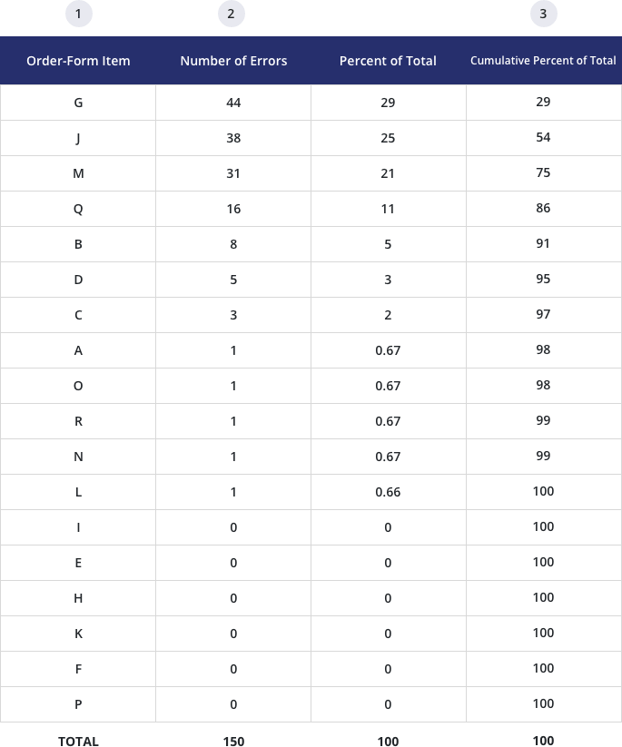
Note that the Pareto table contains the three basic elements described above. The first column lists the contributors, the 18 items, not in order of their appearance on the form, but rather, in order of the number of errors detected on each item during the study. The second and third columns show the magnitude of contribution—the number of errors detected on each item and the corresponding percentage of total errors on the form. The fourth column gives the cumulative-percent of total. This column is the key to Pareto analysis.
“Cumulative-percent of total” is the sum of percents of total down through each position on the ranked lists. At order-form item J, the cumulative-percent of total is 29% + 25%, or 54%. At Q it is 29% + 25% + 21% + 11%, or 86%.
In other words, the first four items, G, J, M, and Q, account for 86% of the total errors detected in the study. These are the “vital few.”
A Pareto diagram of the same data is shown in Figure 15. Again, note the three basic elements that make up the diagram.
Pareto Diagram of Errors on Order Forms
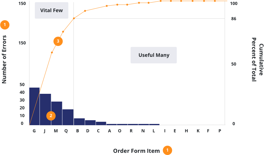
On the Pareto diagram, the 18 items on the order form are listed on the horizontal axis in the order of their contribution to the total. The height of each bar relates to the left vertical axis, and shows the number of errors detected on that item. The line graph corresponds to the right vertical axis, and shows the cumulative-percent of total.
Note how the slope of the line graph begins to flatten out after the first four contributors (the vital few) account for 86 percent of the total.
The remaining contributors (useful many) will not significantly improve the quality on an individual basis and should be eliminated from the team’s agenda for the time being unless a simple solution is available that will address these categories as a group.
Both the Pareto table and the Pareto diagram are widely used, but the diagram form generally tends to convey much more information at a glance than the table of numbers.
The implications of the Pareto analysis for the project team described above are profound. If the team can find remedies that will prevent errors on the four vital few information items, they can significantly improve the quality of order forms coming in from the sales offices. This is an important point: Without the facts and without a Pareto analysis, the team would be faced with the much larger and more costly task of trying to find ways to prevent errors from occurring on all 18 items. The Pareto table or diagram clearly shows that a significant improvement can be achieved with a much smaller, but more precisely focused, effort.
Summary
Pareto analysis leads a project team to focus on the vital few problems or causes of problems that have the greatest impact on the quality effect that the team is trying to improve. In Pareto analysis, facts are gathered and attempt to find the highest concentration of RCCA potential in the fewest projects or remedies. These offer the greatest potential gain for the least amount of managerial and investigative effort.
Cost of Poor Quality in an Automobile Transmission Plant
In our next example, managers at an automobile transmission manufacturing plant used a Pareto diagram to analyze data from the plant’s Cost of Poor Quality accounting system. See Figure 16. The goal of the analysis was to identify the vital few cost categories and to form quality improvement teams to pursue cost reductions. The Pareto diagram clearly shows that a few categories account for the bulk of the overall cost of poor quality in the plant.
Annual Cost of Poor Quality
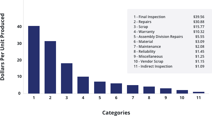
While the diagram in Figure 16 does serve the purpose of prioritizing the cost categories, it is not clear from the diagram how many categories should be included in the “vital few.” Should the managers concentrate on two? On four? On five? If the team had included a cumulative-percent-of-total graph, or a cumulative-percent-of-total column in the superimposed Pareto table, the vital few would have been easier to identify.
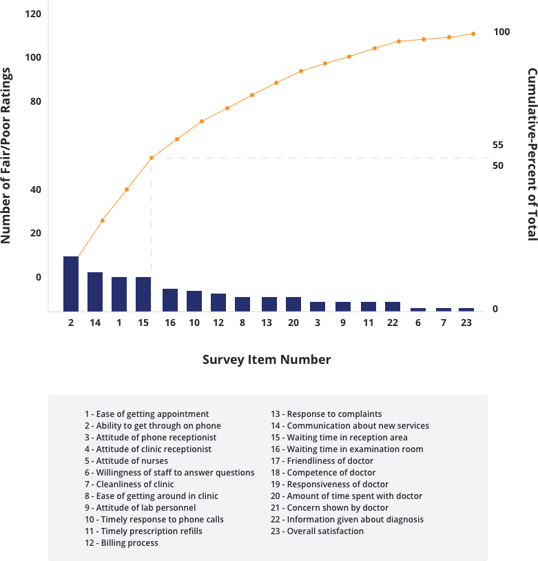
Medical Center Customer Survey
Like other improvement tools, Pareto analysis is equally useful and effective outside of manufacturing applications. For example, an improvement team at a large medical center was formed to look into causes of patient dissatisfaction. A preliminary list of 23 likely causes of dissatisfaction was put into questionnaire form, and patients were surveyed.
This next illustration is a Pareto diagram of the analyzed data. Of the 23 surveyed potential causes of patient dissatisfaction, six were found not to be contributors; thus, Figure 17 shows only 17. Of the contributors, the one that the team expected to show up as the leading cause of dissatisfaction (waiting room time) generated fewer responses than three other contributors. Most importantly, the ranking of “telephone access” (i.e., difficulty getting through to physician or having to wait long) as the leading cause of dissatisfaction was unexpected, and its dominance among the vital few led the team to undertake a Pareto analysis of causes contributing to the access problem itself.
Family Practice
Process Steps in Manufacturing an Integrated Circuit
In the example in Figure 18, a project team at a semiconductor manufacturing plant used Pareto analysis as part of their diagnostic journey. An earlier Pareto analysis had revealed that 59 percent of certain operators’ time was spent straightening bent leads on integrated circuit packages prior to shipment. The team conducted a study in which all integrated circuits were inspected for bent leads, before and after each manufacturing process step. The aim of the data gathering and analysis was to determine which of the seven process steps were contributing to the bulk of total bent leads. Figure 18 shows the results of the study.
Pareto Chart Bent Leads Problem
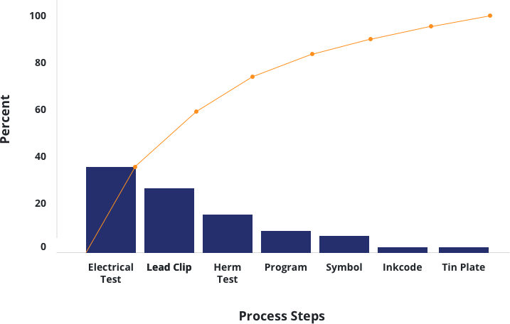
The team found that while bent leads could occur at any of the seven process steps, three of the steps (electrical testing, lead clipping, and hermetic testing) accounted for 75 percent of all the bent leads observed. A simple change in the design of test equipment dramatically reduced the number of bent leads and yielded a 40 percent improvement in productivity.
Pareto analysis can be applied to customer problems as well as to cost-related problems.
Reasons for Delayed Shipments
In Figure 19, a project team in a major chemical company set out to improve customer service. The team determined that a major source of customer dissatisfaction was delays in shipping, and they constructed a cause-effect diagram listing some 13 theories about potential causes for the delays. Next, the team conducted “autopsies” (that is, detailed analyses of actual cases of failure) on a set of delayed orders, and they classified the reasons for the delays into 13 categories. The number of delayed orders in each category was then counted to produce the Pareto diagram shown in Figure 19. Note that in this case only the four leading causes, the vital few, are named in the figure; the other nine are represented as a group in the bar labeled “useful many.”
Improvement in Customer Service
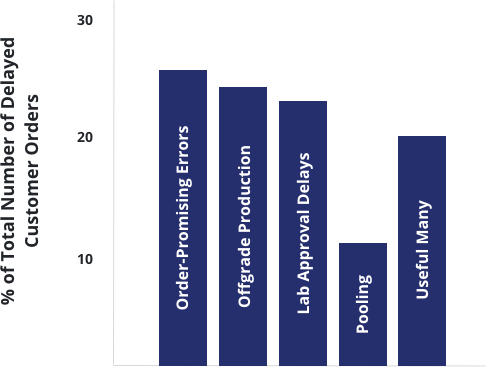
While all 13 theories about the causes for delays were correct (i.e., there was at least one example for each theorized cause), the top four categories, Order-Promising Errors, Off-grade Production, Laboratory Approval Delays, and Pooling, accounted for 80 percent of the delays. Cause-effect diagrams, “autopsies,” and Pareto diagrams are often used together, as illustrated in this example, to separate the vital few root causes of a problem from the others.
Since the nine other causes (“useful many”) were lumped together and plotted as a single bar accounting for 20 percent of the delayed orders, the reader can conclude that the four vital few together account for 80 percent of the delays. But while the cumulative-percent of total can be deduced from this type of chart, it is not as clear as on charts with superimposed line graphs or other notations. Furthermore, although using a “miscellaneous” or “all other” category is sometimes helpful for presentation purposes, it may obscure the basic point that while there are many other causes, their individual contributions are so small that it is not profitable to deal with them.
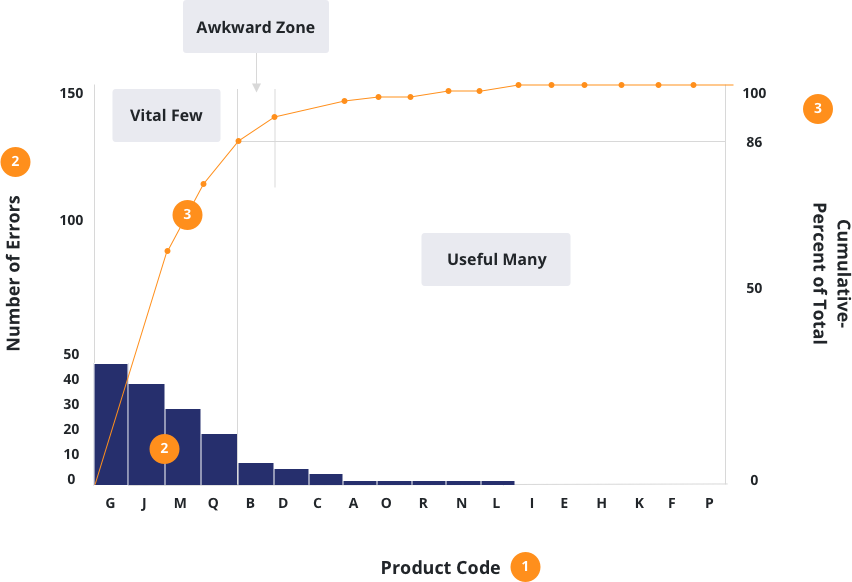
Product Returns
A product manager asked an improvement team to reduce the high occurrences of product returns. Using existing data, the team decided to analyze the products that were returned most often. They decided to use existing product codes, which were designated by letters: A, B, C, D, E, etc.
By using the frequency of occurrence for each product, the team developed the following Pareto diagram. This allowed the team to target the vital few product codes that contributed to the problem of product returns.
Both the Pareto table and the Pareto diagram are widely used, but the diagram form generally tends to convey much more information at a glance than the table of numbers.
On the Juran Pareto diagram, the 18 product codes are listed on the horizontal axis in the order of their contribution to the total. The height of each bar relates to the left vertical axis, and shows the number of product returns on that item. The line graph corresponds to the right vertical axis, and shows the cumulative-percent of total.
Note how the slope of the line graph begins to flatten out after the first four contributors (the vital few), accounting for 86 percent of the total. Sometimes there is not a clear break point between the vital few and the useful many. Dr. Juran referred to this as the Awkward Zone.
Sometimes a Pareto diagram does not produce a clear picture of the vital few categories because each of the categories is nearly equal in importance. When this happens, it does not mean that the Pareto principle does not apply to the problem. If the team will try some other way of classifying the problem, they will almost certainly find at least one classification that will produce a “vital few.”
Suppose that the vital few product codes in the Pareto diagram had very little difference in frequency of returns. There would have been no obvious way to focus on the vital few.
The next step would be to classify the returns by some other factor, rather than the product code. Other possible factors might include:
- Reason for return
- Department of return
Some typical classifications that lead to finding the vital few include:
- Type of error
- Time of day, week, month, or year
- Sequence—the first, second, third, etc.
- Type of activity or product
- Characteristics of groups or individuals doing the work
- Characteristics of patient or other customers
- Place where the work is done
Start applying the Pareto Principle in your organization by reading our guide on how to construct a Pareto Diagram.
Webinar: The 80/20 Rule AKA The Pareto Principle
First published: 28th February, 2018
Watch this complementary webinar presented by Dr. Joseph A. DeFeo, to learn more about how the Pareto Principle can speed up your improvement journey as it applies to your organization today.
The Pareto Principle, also famously known as the 80/20 Rule, is a universal principle applicable to almost anything in life. The 80/20 Rule claims that the majority of an effect (or consequence) comes from a small portion of the causes from that event. It is one of the best tools to use in order to focus on improving performance. Dr. Joseph M. Juran suggested the principle and named it after Italian economist Vilfredo Pareto who noted the 80/20 connection when he showed that approximately 80% of the land in Italy was owned by 20% of the population.
The 80/20 Rule not only shows itself in applications like economics, but also science, software, sports, business management, mathematics, and more. Today, organizations need to use the Pareto Principle to help them separate the “vital few” problems from the “useful many.” The premise behind this rule is that improvement efforts will be more effective if the vital few are addressed first.
For more information on the Pareto 80/20 Principle and how Juran can help you leverage it to improve business quality and productivity, please get in touch with the team.
| Check out Juran’s LSS Training Courses |
| Lean Six Sigma Yellow Belt |
| Lean Six Sigma Green Belt |
| Lean Six Sigma Black Belt |
| Upgrade to Black Belt |
| Lean Six Sigma Master Black Belt |
| Lean Expert Program |